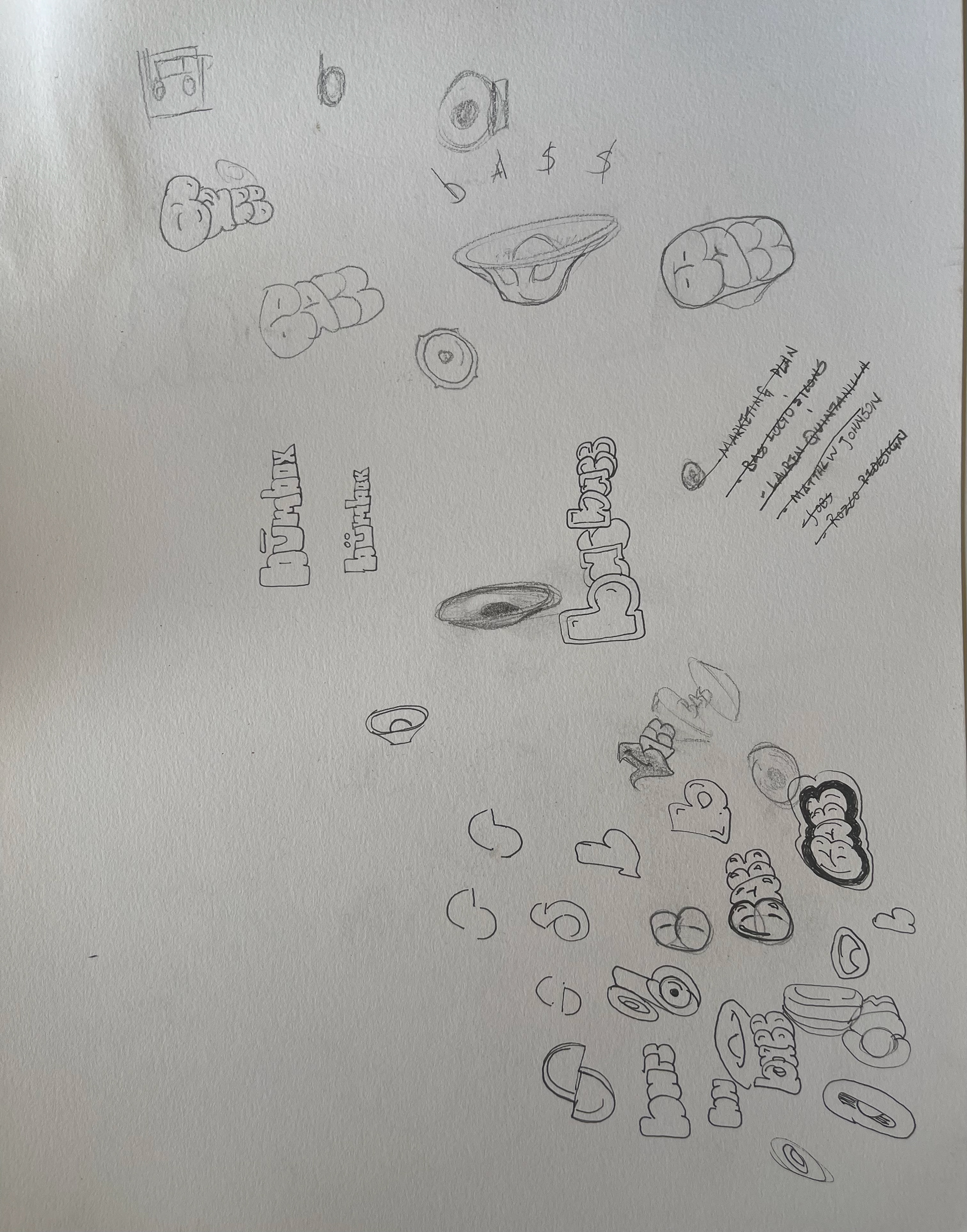
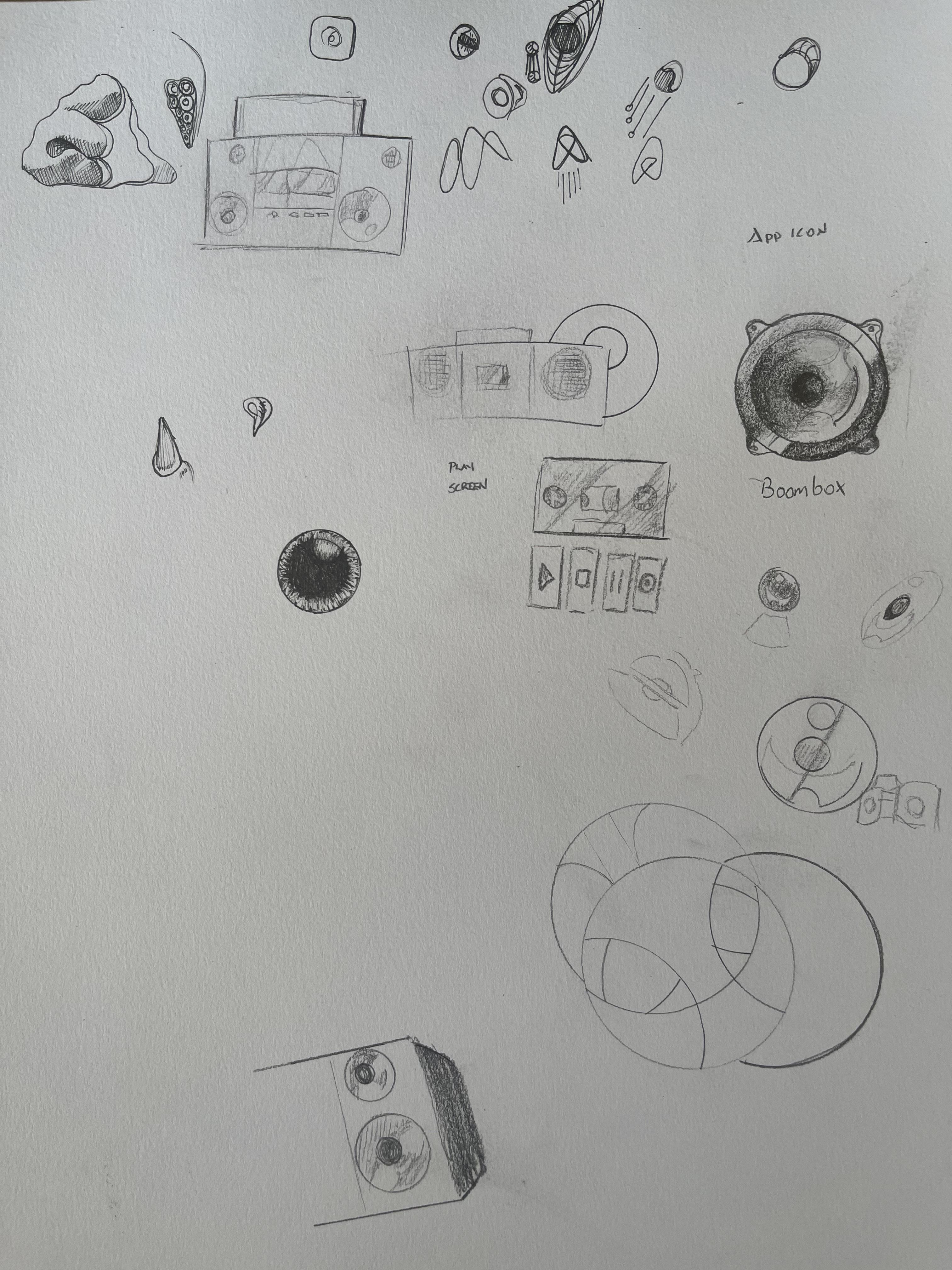
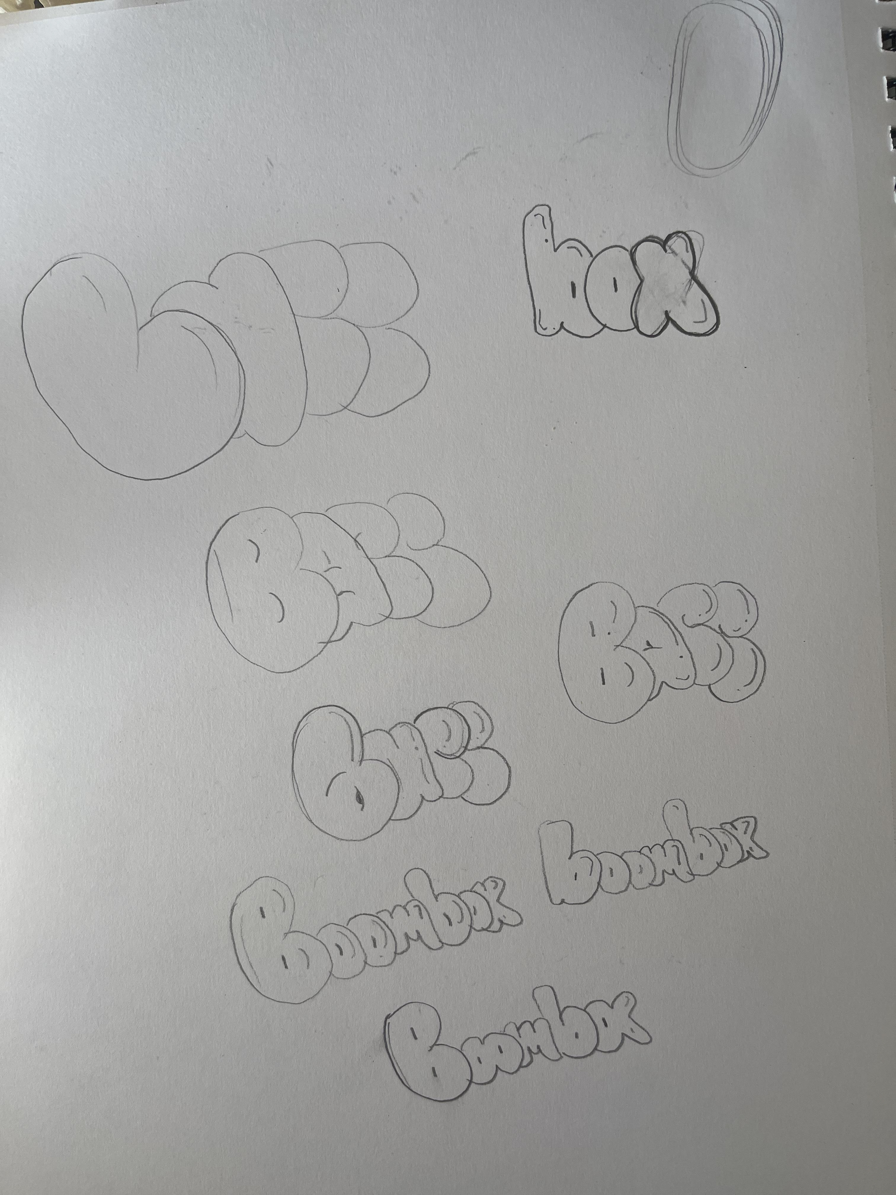
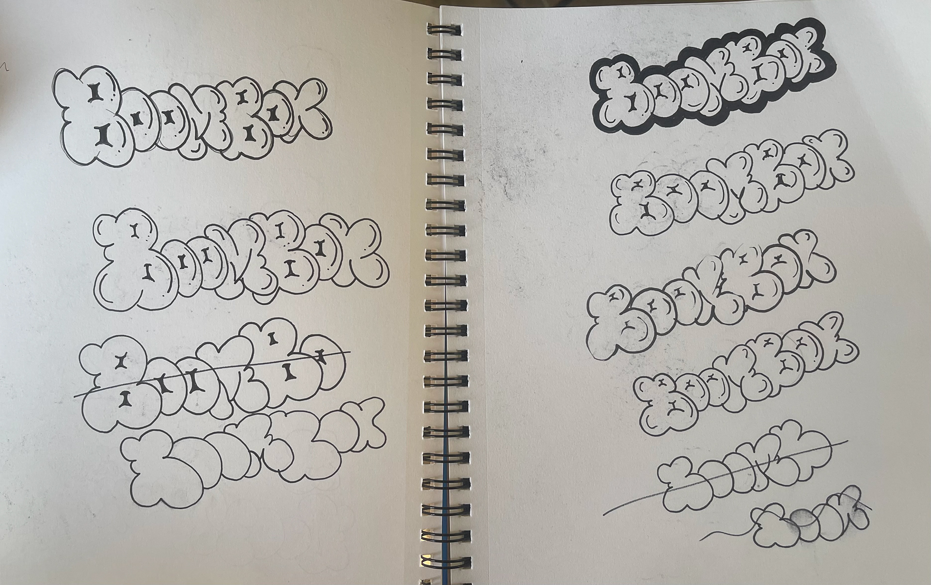
For the this challenge, I tackled designing a logo for a streaming music service.The prompt for this challenge stressed the importance of differentiating itself from the "Big Three" of streaming services: Spotify, Apple, and Soundcloud. Those services, while being instantly recognizable, have a visual identity that, to me, seems corporate and the antithesis of the rebellious beginnings of popular music, as well as the internet. Being a fan of the DIY ethos of both hip hop and punk, I decided to use hand lettering reminiscent of graffiti. I sketched the word on paper, then hand digitized the word in Adobe Fresco. Initially, I planned on incorporating a boombox into the finished design, but after several attempts decided that the hand lettering alone presented a cleaner design without detracting from the overall ethos. This minimalist color palette also contributes to the DIY ethos of the two distinct musical genres that informed the design. The end result is a design that is simultaneously playful and rebellious, and would be instantly recognizable and distinct against the other streaming services.
Color Palette

#262626 | 71, 65, 64, 69

#f2f2f2 | 4, 2, 2, 0
Process Sketches


