AB Lifestyles, the division of Allyson Brooke, Inc. specializing in RV bedding, mattresses, and outdoor lifestyle apparel and accessories, sought to refresh its visual identity to better capture its essence of outdoor adventure while appealing to two distinct demographics: active retirees within the RV community and affluent individuals aged 25-45 who embrace RV and tiny home culture. Although satisfied with their existing logos—a wordmark featuring a sun motif and various ornamental elements alongside the company's slogan, and a separate logo featuring a camper outline—the company's owners recognized the need for a branding overhaul to align with their corporate vision and engage their diverse audiences effectively. Additionally, they expressed a desire to move away from the literal camper imagery and integrate the sun motif more prominently.
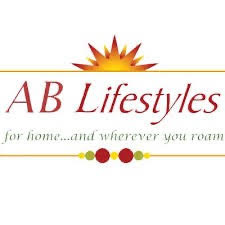
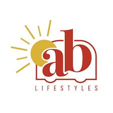
The previous AB Sun and Camper logos.
In addition to the logo redesign, the owners wished to update their current color palette and typography to better match their corporate vision.
The redesigned logo is a wordmark that centers on a simplified rising sun motif, with "AB" integrated as a knockout within the emblem. It is presented in three brand colors: Zion, Bryce Canyon, and Big Bend Blue. The wordmark utilizes the new brand typefaces, Merriweather Black for "AB" and Karla Extra Bold for "Lifestyles," offered in two orientations: horizontal for versatile application across print, web, apparel, and packaging, and vertical for specialized uses such as sewing labels.
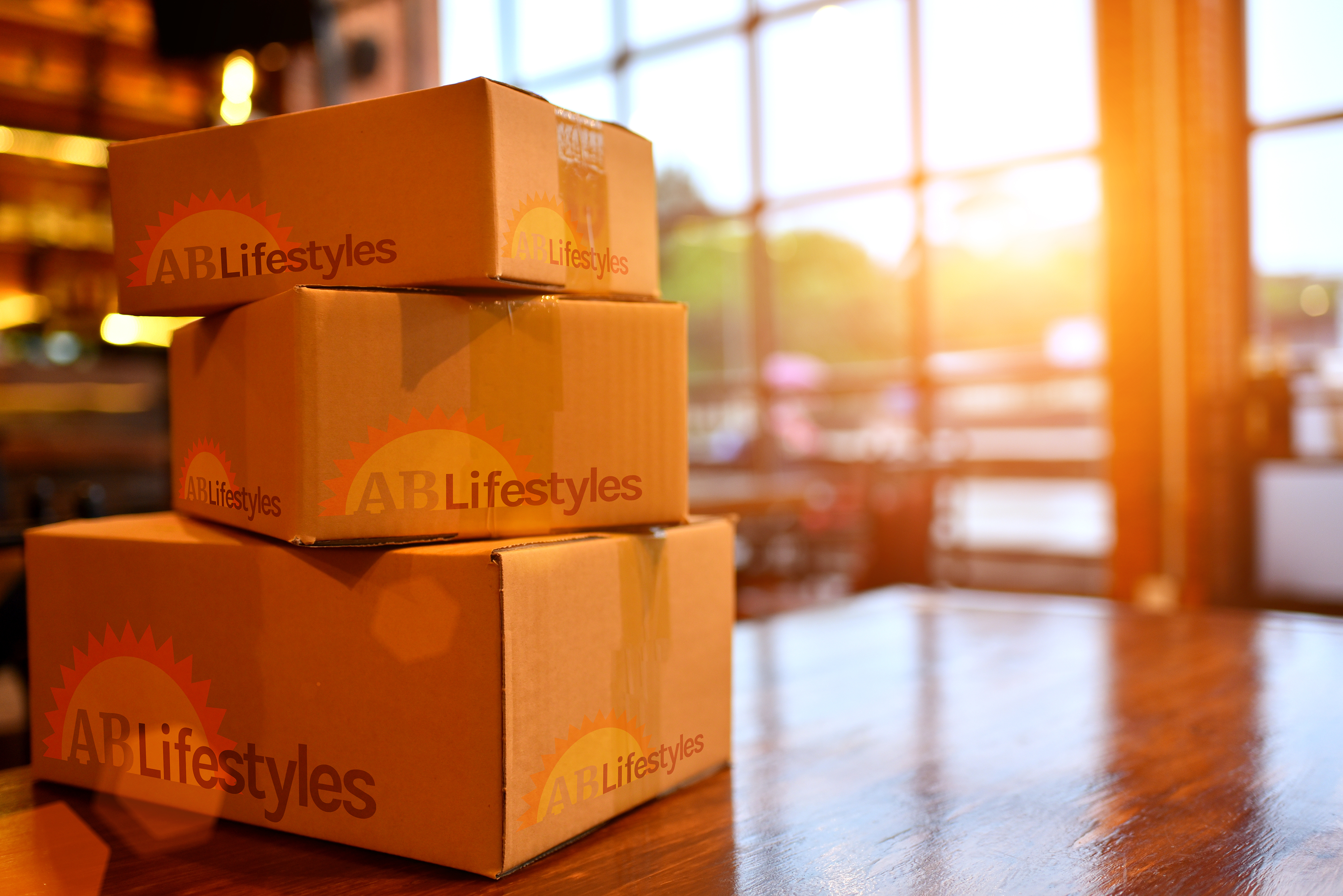
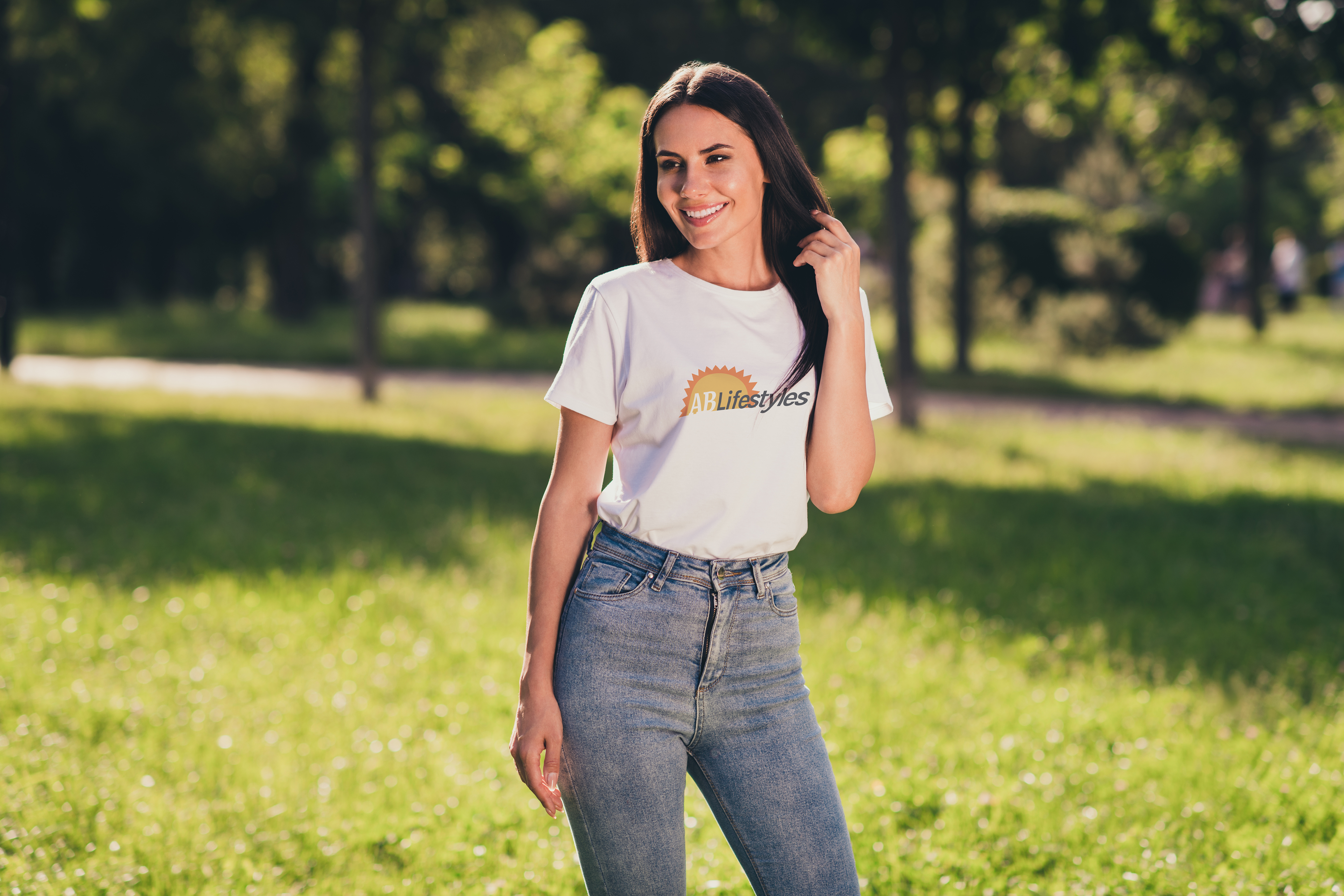
Color Palette

AB Black | #000000 0,0,0,100

AB White | #FFFFFF 0 ,0, 0, 0

Badlands | #F2E2C4 0, 7, 19, 5

Big Bend Blue | #131826 50, 37, 0, 85

Bryce Canyon | #F26B1D 0, 56, 88, 5

Carlsbad | #OA7ABF 95, 36, 0, 25

Cascade | #F2F2F2 0, 0, 0, 5

John Muir Green | #59551B 0, 4, 70, 65

Redwood | #D94E41 0, 64, 70, 15

Wind Cave | #A6785D 0, 28, 49, 35

Zion | #F2911B 0, 40, 89, 5

Yellowstone | #F2833D 0, 26, 75, 5
Inspired by the iconic aesthetics of WPA National Parks posters, the updated color palette comprises 12 colors reflecting the natural beauty of the United States and the nostalgia of the “Golden Age of Camping” (1930s-1970s). This thoughtfully curated palette, featuring analogous and complementary hues, aims to evoke a sense of nostalgia and American pride among the brand's older demographic while inspiring adventure and stewardship among younger audiences.
TYPOGRAPHY
The typography for AB Lifestyles adopts a modern and sophisticated pairing of Karla and Merriweather typefaces, complemented by various fonts within each family for enhanced versatility and legibility across print and digital platforms. Sized according to the Golden Ratio principle, the typography ensures visual harmony and readability across diverse applications.
AB Home Logo
The redesign of AB Home, the home furnishings manufacturing and retail arm of Allyson Brooke, Inc., adheres meticulously to AB Lifestyles’ branding directives. While evoking elements of the former Allyson Brooke Home logo, the new wordmark achieves a sleek, contemporary aesthetic.
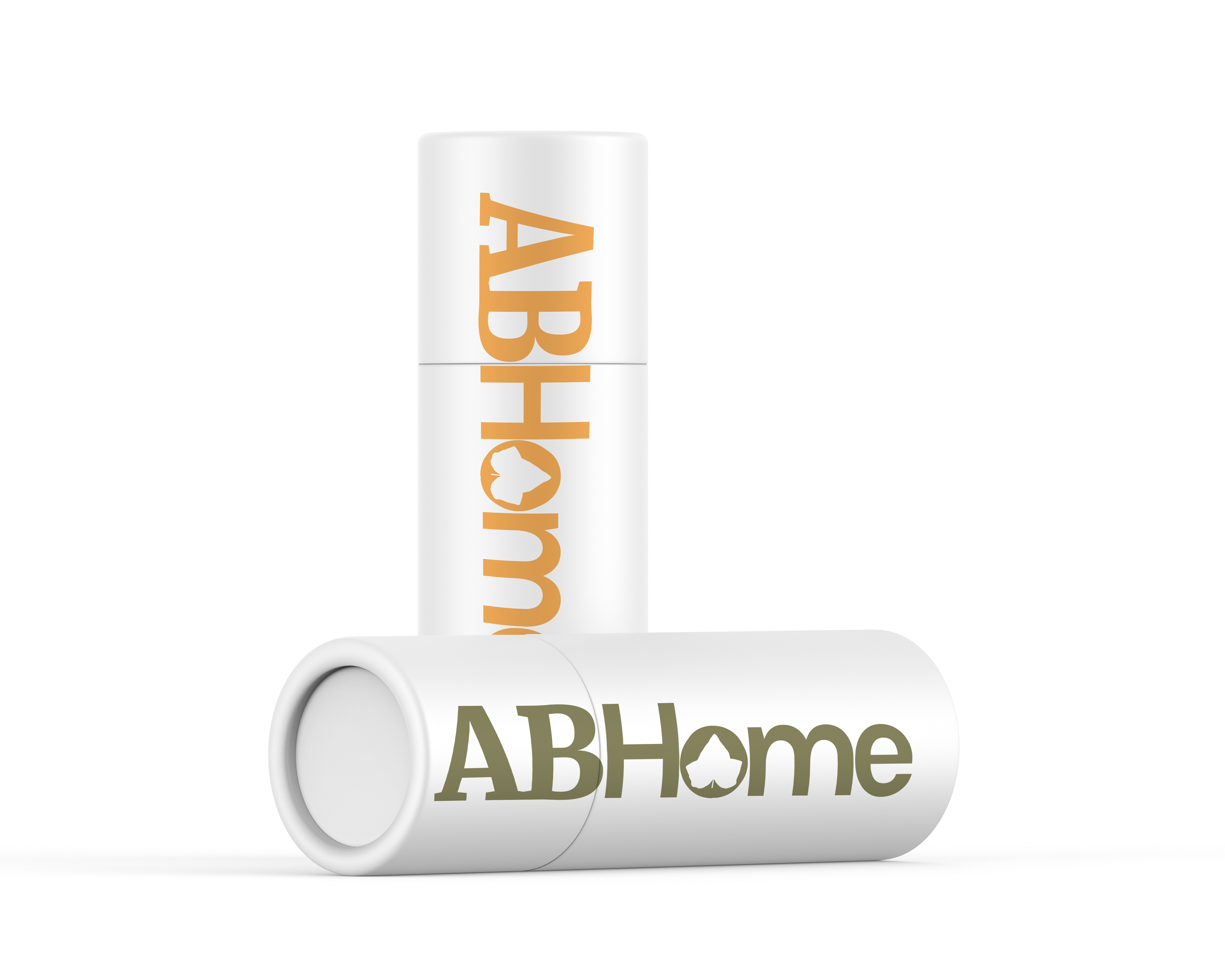
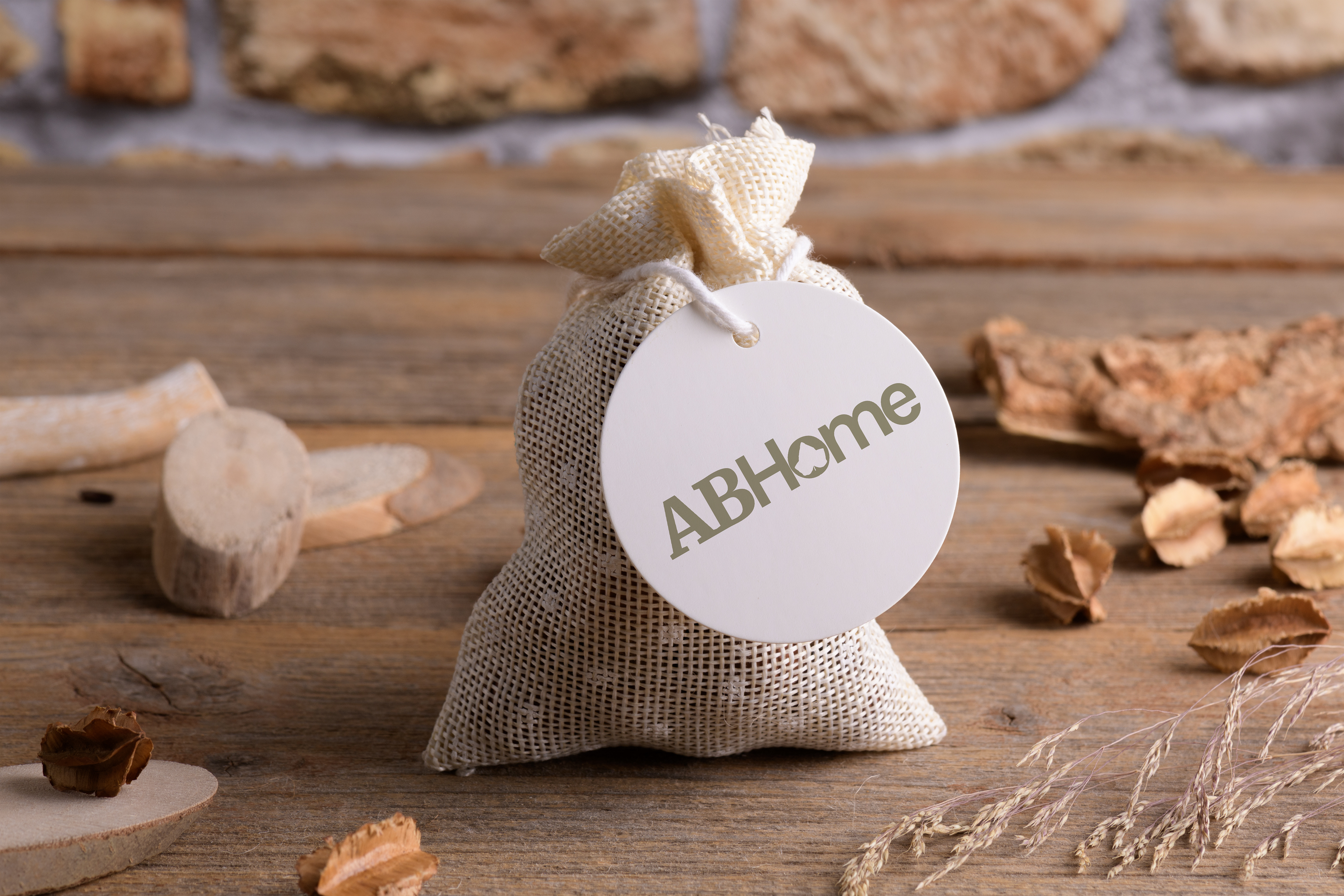
Drawing inspiration from the previous Allyson Brooke Home logo, the wordmark now embraces a more streamlined and modernized appearance. It prominently showcases the AB Lifestyles brand color, John Muir Green, and employs the brand’s designated typefaces, Merriweather Black and Karla Extra Bold. Notably, a leaf motif adorns the counter of the letter “o” in “Home,” adding a subtle homage to the previous logo as well as as nod to the brand’s commitment to creating sustainable and organic products.
The previous Allyson Brooke Home logo
Additionally, the wordmark is presented in two distinct variations, utilizing the aforementioned brand color John Muir Green and also in Zion, specifically curated for use during the autumnal months. This strategic color adaptation ensures seasonal relevance while maintaining visual cohesion with the overarching brand identity.
Scheduled for implementation in Summer 2024, the new AB Lifestyles visual branding embodies the company’s commitment to innovation, customer engagement, and alignment with its core values amidst an ever-evolving market landscape.
